If you’re new to painting, starting on a blank canvas can feel a little scary. You may be excited to paint, but also unsure where to begin. This often leads beginners to as a simple question: what is an underpainting, and do I really need one?
An underpainting is the first layer of paint you put on a canvas before adding your main colors.
It’s usually done with one color (or a small selection of colors) and helps plan your painting by setting up basic shapes, light and shadow.Think of it like a sketch with paint, it provides the foundation.
Some painters find it difficult to start painting on a white canvas as it can be overwhelming.
I’ve actually wrote about the fear of a blank canvas in another post you can read here.
One of the reasons an underpainting can help is, it makes it easier for the painter to judge colors, see contrast, and avoid overworking areas in the painting process.
In this post, you’ll learn the most common colors artists use for underpainting, how painting with one compares to painting without one and how to start the process on a blank canvas.
How to choose a color
Some artists use warm colors like burnt sienna, others prefer cool blues or grays and some artists completely skip this stage and paint directly on the canvas.
All of these approaches are valid, especially for beginners.
The key is the reason why you may choose one method over the other.
⬤ Blue underpainting
Blue establishes a cool and calm mood in a painting.
Works well for shadows, skies, and water and helps unify cool color palettes.
This is often used for atmospheric airy scenes.
⬤ Red underpainting
Red can add warmth to a painting. When the top colors are applied red can subtly glow through the layers.
Red is a warm color that contrasts cooler tones like blue and greens.
So placing red underneath can make cool colors pop.
This is especially useful in landscapes: red under sky/water scenes and foliage.
⬤ Green underpainting
Green helps balance warm colors, especially in skin tones.
Traditionally used in portrait painting, warm layers over green appear more natural.
It adds subtle depth and realism.
⬤ Pink underpainting
A pink underpainting adds vibrancy and warmth.
This color also enhances saturation in the upper layers of a painting.
This gives paintings a modern or expressive feel, this is common in bold or emotional work.
⬤ Grey underpainting
A grey underpainting focuses on values rather than color.
This helps define light and shadow early which makes later color application more controlled.
This is used in classical and realistic paintings.
Underpainting vs no underpainting
The choice to use an underpainting – or to paint without one – is not just a stylistic choice but also a decision that affects the color, workflow and even the emotional depth of a painting.
Both approaches have been used by artists, but they serve very different purposes.
Why artists like to build in layers
Underpainting provides the structure of the painting before full color is introduced.
Traditionally, it is used to establish values (light and dark) and composition early in the process.
By separating value decisions from color decisions the mental load is reduced for an artist.
From a visual standpoint, underpainting enhances the color richness and luminosity.
When thin layers of paint are applied on top, the underpainting subtly influences how the colors are perceived.
This is actually one reason classical paintings often appear to glow from within.
A single underlying color or value also unifies composition.This prevents the surface from feeling separate as the underpainting provides structural cohesion.
Why artists choose to paint directly on canvas
Painting directly on a canvas prioritizes spontaneity.Instead of building a painting in stages, the artist works with the final colors from the start, responding intuitively as the painting develops.This approach is commonly associated with impressionism and modern expressive styles.
One advantage of skipping underpainting is the freshness of colors.The painting is not influenced by an underlying layer, which can be beneficial if you want a clear, bright and bold color relationships.
For artists working with opaque media like thick acrylics and heavy body oils, an underpainting may be less visually impactful, making direct painting more efficient. However, painting without underpainting often requires a sense of confidence in value control and color from the outset.
This makes mistakes in proportion, contrast or color harmony harder to correct later, since there was no foundational structure guiding you.
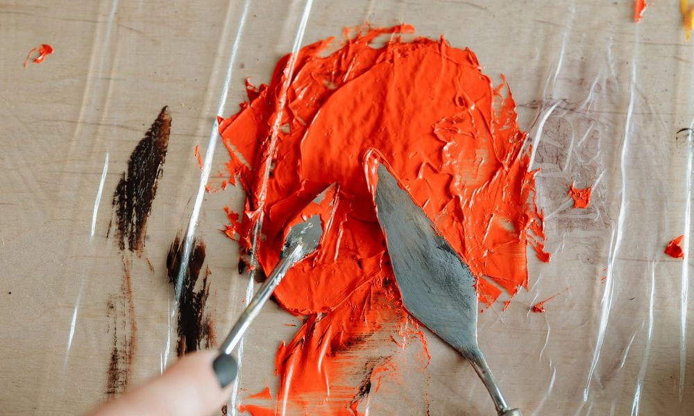
The method
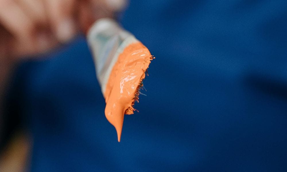
For beginners, the simplest and most forgiving choice for an underpainting is acrylic paint. Acrylic dries quickly, is easy to thin with water, and wont reactivate once dry, which makes it suitable for this technique.
A small palette of one or two colors is enough.The first step is usually a toned surface, this can be done with a thin wash of paint brushed evenly across the whole canvas.
This step removes the glaring white and establishes a simple tone. Some people stop at this stage, wait for the paint to dry and then start working on the upper layers.
Other artists use this opportunity to block in large shapes and values, not details.Think in terms of light and dark shapes rather than objects.
Use loose brush work to map out the composition. Once this layer is dry, you will have a guide rather than a finished image.
This will make the rest of the painting process feel clearer and less overwhelming.
Shop the colors